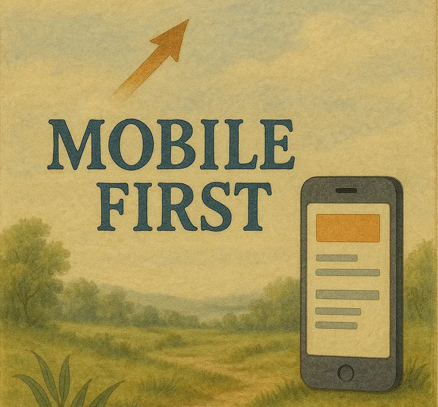
Mobile-First Design: The Key to a Better User Experience

Introduction
Most people now visit websites from their phones. That simple fact has changed how professional websites should be designed. Mobile first design means designing a website starting with the mobile experience and then expanding it for larger screens. This approach prioritizes clarity, speed, and usability where it matters most. For small business websites mobile first design is no longer optional. It is essential for user experience, search visibility, and conversions.
Why Mobile Usage Dominates the Web
This should be no surprise-look around you. Phones are always within reach. People search for services while commuting, waiting in line, or sitting on the couch. When they land on a website they expect it to work instantly. If a site is difficult to read, slow to load, or hard to navigate on a phone users leave. They rarely come back. Designing for mobile first acknowledges how people actually use the internet rather than how we wish they did.
What Mobile First Design Actually Means
Mobile first design does not mean shrinking a desktop site to fit a smaller screen. It means starting with the most constrained environment and making intentional decisions about layout, content, and interaction. Every element must earn its place. We've all experienced going to a website on our phone, maybe the local pizza joint, and it looks like an exact miniature version of their desktop webite. I suppose that would be ok if a mouse were using our phone, but human fingers cannot interact with buttons that small and our eyes can't read text that small-that's just bad design.
Luckily, it's not 2010 anymore and we can do better. Taking the mobile-first approach is the only acceptable way to design a website anymore. It means that navigation is simplified (we're a big fan of the hamburger menu-just look at our website on a mobile device), text is readable without zooming, buttons are easy to tap, pages load quickly even on slower connections, and so on. Once the mobile experience works perfectly the design can expand gracefully for tablets and desktops.
Better User Experience Starts with Focus
Mobile screens force focus. There is no room for clutter. This is a benefit rather than a limitation. Mobile first design encourages clear messaging, strong hierarchy, and purposeful layout. Visitors should immediately understand who you are, what you offer, and what to do next. When that experience works on a phone it almost always works better everywhere else. Good user experience is about removing friction. Mobile first design does exactly that.
Mobile First Design Improves Website Speed
Performance matters more on mobile devices. Phones often rely on cellular networks and less powerful hardware. Heavy images, unnecessary scripts, and complex layouts slow everything down. Mobile first design naturally leads to faster websites because it prioritizes efficiency. Only essential elements are loaded. Code stays lean. Pages respond quickly. Faster websites keep visitors engaged and reduce bounce rates. They also perform better in search results.
Search Engines Prioritize Mobile Experiences
Search engines evaluate websites based on their mobile versions first. If your mobile experience is weak your rankings suffer regardless of how good the desktop version looks. This makes mobile first design a critical part of SEO strategy. A site that loads quickly, displays content clearly, and works smoothly on mobile devices sends strong quality signals to search engines. Mobile usability is no longer a bonus. It is a baseline requirement.
Mobile First Design Supports Conversions
Conversions often happen on mobile devices. Calls are made from phones. Forms are submitted from phones. Directions are requested from phones. When the conversion path is awkward or frustrating on mobile, users do not patiently fight through it. They leave. Think about it. You are out of the house and craving a pizza. You pull up your local pizza joint’s website on your phone and everything looks wonky. The text is tiny. The buttons are hard to tap. You cannot even find the phone number. Do you spend ten minutes hunting for it? Do you go home and open your desktop computer just to place an order? Or do you give up and call the next place that pops into your head? Mobile first design makes sure that does not happen. Calls to action are visible, accessible, and easy to complete. Even small improvements in mobile usability can lead to meaningful increases in leads, calls, and inquiries.
Mobile First Design Works Best with Clean Code
Mobile first design pairs naturally with hand coded websites. Clean HTML structure, efficient CSS, and minimal JavaScript allow layouts to adapt smoothly to different screen sizes. There is no unnecessary overhead fighting against responsiveness. This leads to better performance, fewer bugs, and easier long term maintenance. Good design and good code reinforce each other.
Better User Experience Starts on Mobile
The web has already shifted. Mobile usage continues to grow and expectations continue to rise. Websites that ignore mobile first design fall behind quietly. Traffic drops. Rankings slip. Leads decrease. Websites that embrace mobile first design stay relevant, accessible, and competitive. For small business owners this approach provides a practical advantage rather than a technical one.
Mobile first design aligns your website with how people actually browse, search, and interact online. It improves usability, performance, search visibility, and conversions. It simplifies design decisions and strengthens long term results. A website built with mobile users in mind delivers a better experience for everyone. That is why mobile first design is the key to a better user experience and a more effective website overall.